
Style Tile, Severance Website Concept
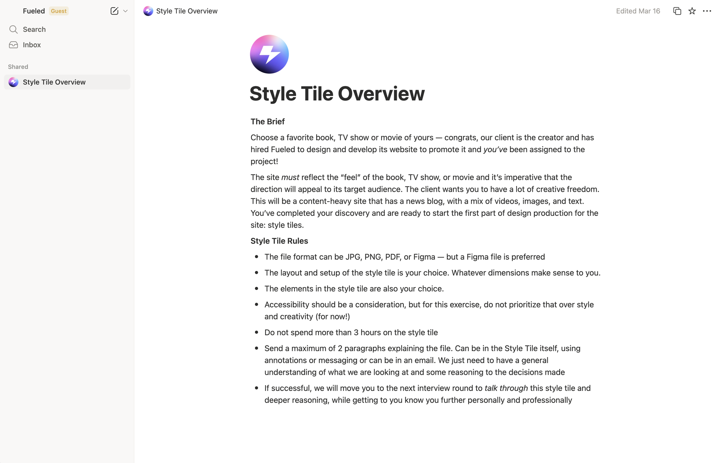
This project was a time-boxed design exercise for the design agency, Fueled, where I was tasked with creating a style tile for a content-heavy promotional website for a chosen media property. I selected Severance as the conceptual foundation and developed a visual direction for a fictional streaming-style marketing site that would include editorial content, video, news updates, and image galleries. The goal was to define a scalable visual system that reflects the tone, themes, and audience of the show. Click to view Figma File.
Client
Fueled (Design Exercise)
Supervisor/Director
Allison Schumacher
PROBLEM
The exercise required translating an existing narrative world into a digital product experience without predefined brand guidelines.
The site needed to support a content-heavy structure including editorial articles, media assets, and video content.
Visual direction needed to balance creativity with system thinking under a strict 3-hour time constraint.
The challenge was to define a cohesive style system that could scale into a full CMS-driven website.
Deliverables
Style Tile
Visual System (Typography, Color, UI Components)
Moodboard
Conceptual Web Design Direction
Design Rationale Summary
PROCESS
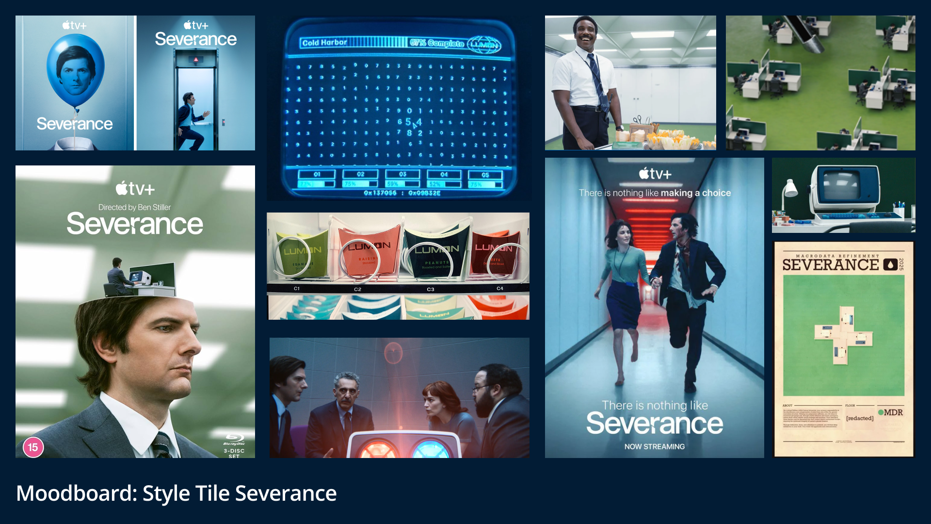
Selected Severance as the conceptual subject due to its strong visual identity and thematic contrast between corporate control and human emotion.
Conducted rapid visual research of show stills, promotional material, and thematic references to extract key visual motifs.
Developed a moodboard focusing on sterile corporate environments, controlled symmetry, and restrained color psychology.
Defined target audiences including existing fans, new viewers, and media/press stakeholders.
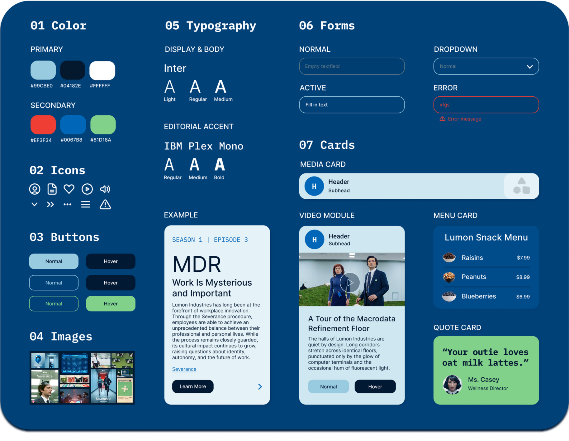
Established a design direction using a modular grid system to reflect the show’s rigid corporate structure.
Explored typography systems using Figma, pairing editorial serif/sans choices with monospaced type to reflect institutional and technological themes.
Built a style tile incorporating typography, color system, UI components, and imagery direction.
SOLUTION
Created a complete style tile defining the visual foundation for a Severance-inspired promotional website.
Established a restrained color palette of cool tones with minimal accent contrast to reflect the show’s controlled environment.
Designed a typography system combining structured sans-serif and monospaced type to reinforce corporate and technological themes.
Defined UI components and layout principles based on grid rigidity and modular content blocks.
Incorporated cinematic imagery direction and iconography aligned with the show’s tone and narrative world.
Produced a scalable visual system that could extend into full website design and CMS-driven content.
RESULTS
Completed within a 3-hour time constraint as part of a design interview process for Fueled.
Successfully communicated a cohesive visual direction aligned with the narrative tone of the selected property.
Advanced to discussion stage to present and defend design rationale and process thinking.
Demonstrated ability to rapidly translate abstract narrative concepts into structured UI systems.